Task 2(A) & (B) : Typographic Exploration & Communication
Advanced Typography / Exercise
Low J- Yin / 0352888
Bachelor of Design in Creative Media / Advance Typography

INTRODUCTION
LECTURERS
Click here to refer to
Task 1.
EXERCISE
Task 2(A) and 2(B) will require to explore the boundaries of typographic
communication using the knowledge gained from all modules not withstanding
this semester’s exercises of Typographic Systems and Type & Play.
Synthesise the knowledge and create a key artwork that excites and memorable.
fig 1.0 wordmark
I had started the task with my name: J Y I N, as my personality, I am a very
clumsy but fun person, so i would like to make the words like it. I try to
used the square to make the word pixels but the result does not turn well. I
try to use bumpy and round style to digitise the word.
fig 1.1 developing
I had chosen one of my favourite from my digitised word mark. I want to make
the "j""i" looks like the eyes and "y" as my smiley face with cheeks at the
first, and I want to use round and bumpy style so i try to experiment the
words. I used a reflection "?" as "j" and reflection "!" as "i" to shows the
excitement of the word mark.
fig 1.2 developing of "n"
The "y" develop from the "j", i had use the bumpy style for my "y". For the
"n" using the development of "y", with the adjustment and inspiration, I
created the "n" but the result does not shows well, so i continued to digitise
it.
fig 1.3 developing of word mark
By the development and adjustment, I find out the space between each word are
too distance, so i shorten the "y" and refined the words.
fig 1.4 space between words
After the step-by-step adjustment, I had place the square between to check on
the space and kerning between.
fig 1.5 final digitise word mark
The feedback from sir seems well, so I used this bumpy and fun style as the
final digitise word mark. The result shows the hint, that the "jyi" shows the
smiley face, but as the result, its looks more like a crying smiley face, but
showing a very clumsy feeling.
Final Digitise Work Mark:
fig 1.6 Digitised Work Mark, JPG (9/27/23)
Black & White Digitised Word Mark, JPEG :
fig 1.8 Digitised Work Mark, JPG (9/27/23)
Color Palette:
fig 1.7 Color palette
For the colour palette, I want it to be very funky and cute, so I decided to
choose this. I place the colour into the word mark with the primary colour and
the lightest colour.
Colour Digitised Word Mark, JPEG :
fig 1.9 Digitised Work Mark, JPG (10/1/23)
fig 1.9 Digitised Work Mark, JPG (10/1/23)
After created the digitised work mark, I had started to work on the animated
gif. I am using the "?""!" as my signature. I used both of the "." from both
of the punctation as the first impression of my GIF, here is the final result
of my GIF.
Final Animated GIF:
fig 2.0 Animated Work Mark, GIF (10/4/23)
IG Page & tiles (9), JPEG:
fig 2.1 Digitised IG Post, JPG (10/12/23)
IG Page & tiles (9), PDF:
fig 2.2 Digitised IG Post, JPG (10/12/23)
Here is the link to my IG Page:
fig 2.3 IG Profile
FEEDBACK
Week 6
General Feedback:
Sick Leave
Week 7
The word is not refined enough and could need to be more constructive.
INFLECTION
Experience
For this task, we not just need to created a unique work mark, as we need to
use our own name. But sometime, idea just suddenly pop up on our mind. I was
spending lots of time on creating work mark, while I was presenting my work
mark to sir, I had said I wanted a very clumsy but fun style for my work
mark. Sir require us to try do some new ideas on class, I was trying like
after 5 minits and suddenly created the work mark and refined it as the
final output.
Observation
The process take brain storming and also our design sense to check on the
measurement and weight between the words. When refining the words, it was
quit a hard part to me as I always hate to make choice, and we need to
choice which is the best on every step when u refine.
Findings
Every step is a big foot step. It is a very difficult part to me. We need to
be very careful, might the curve line or the straight line we made.
FUTHER READING
fig 2.4 Typographic design: Form and communication (2015)
I had started reading this book " Typographic design: Form and
communication", the book is published on 2015.
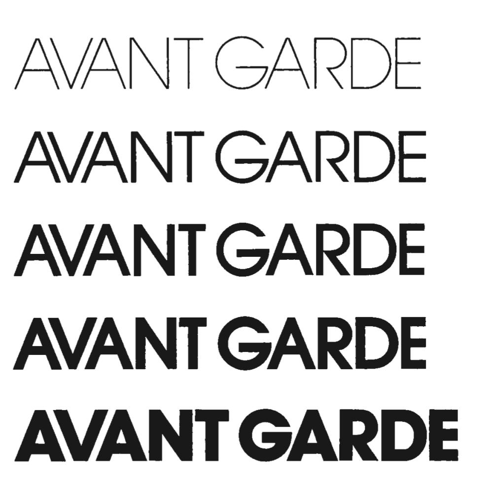
fig 2.5 the changes of same typeface
Using same typeface but different element could also make the
typeface looks very different as in:
1. Weight Changes
2. Proportion
3. Angles
4. Elaboration
fig 2.6 Letter
We memorise the words with their form and familiar shape. That is also
why sometime even the words are not grouping as the original but the
sentence are still readable; But if the typeface had been changes the
familiar shape, the sentence or paragraph will be hard to read.
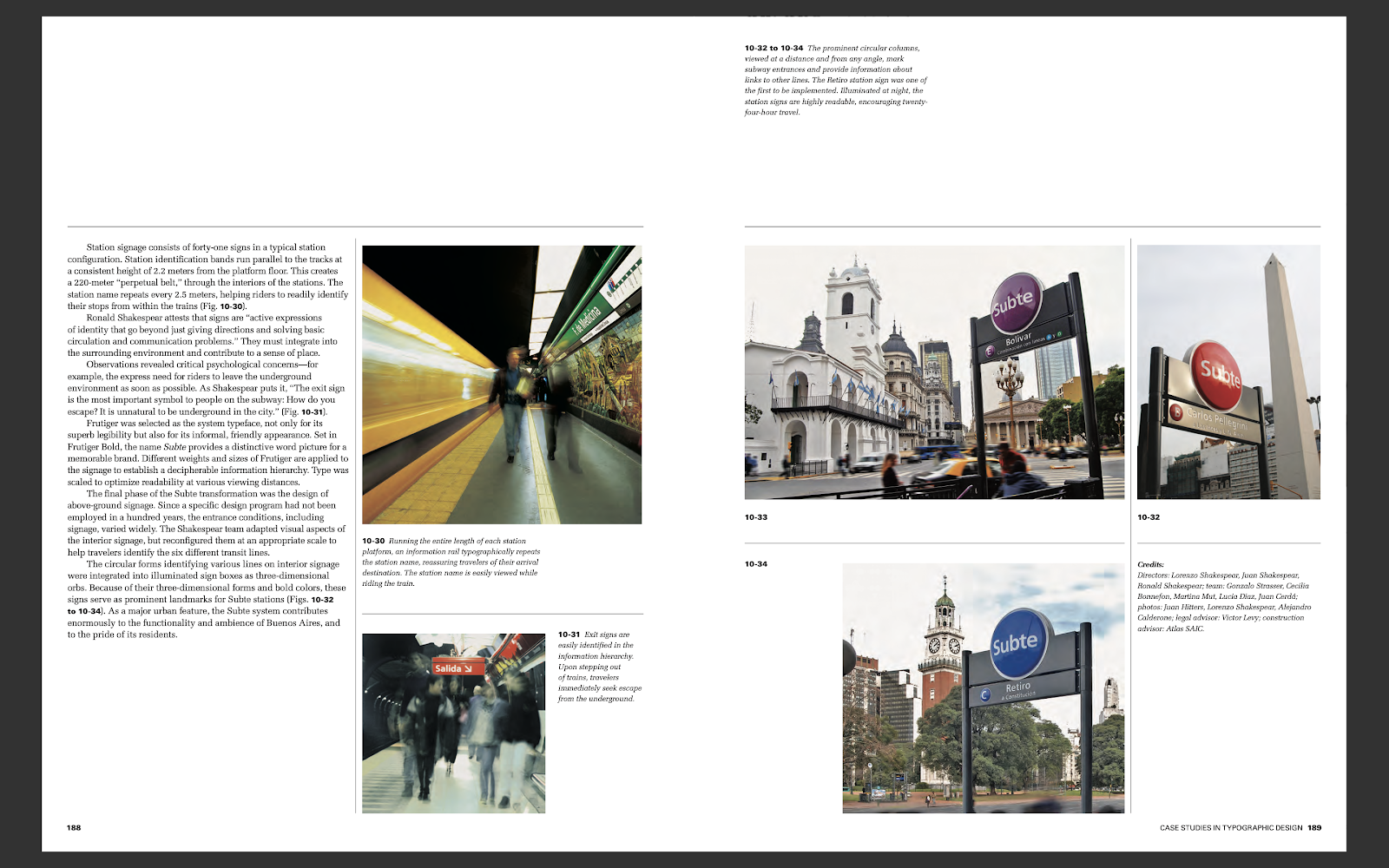
fig 2.7 Sign
The colour of sign board always had been coloured and giving us a very
strong contras. Exit sign are always easy to identified in the
information hierarchy. Upon stepping out of trains, we will immediately
seek escape from the underground. That why the sign are always design as
coloured.
fig 2.8 Construction of the letter B
From the book, we could know that how is the construction of the
letter B, from Albrecht Durer and Geoffrey Tory.
fig 2.9 Typeface
The revolution of the typeface had been design different style and
ways by developing. Many artist using their own design idea and change
the font size and the typeface. The typeface had been designed to the
first fat face, the first Egyptian, the first serif face and more on.


.jpeg)
Comments
Post a Comment